
2021 Alumni Fridays | DCC
Overview
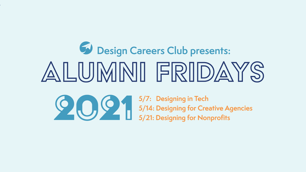
Alumni Day is one of the main events our Design Careers Club hosts every year. Alumni Day aims to empower design students at UC Davis and provide opportunities to connect with alumni and learn from their experiences. We aim to reach out to alumni to discuss their journeys and experiences in the industry. This year, we decided to restructure Alumni Day into Alumni Fridays, where the event will take place over 3 consecutive Fridays to ease zoom fatigue, as well as provide separate themes for each discussion.
Alumni Day 2021 will be limited to a virtual format this year because of COVID-19. Lacking the personal touch to the careers fair, as well as many students' increasing zoom fatigue from having a virtual experience, there is a concern about the number of attendees as well as the usefulness of the event if everyone will be burned out over attending a day long event.
Final Products
-
Brand identity (Logo, graphic standard)
-
Marketing and social media graphics including:
-
event overview graphic (both animated and static)
-
individual event graphics with individual spotlights
-
giveaway graphics
-
presentation template graphic
-
Instagram story template graphic
-
Processes
Original mood boards revolved around a “tech” theme that emphasizes the virtual platform in which “Alumni Fridays” are hosted, and a “messaging” theme that emphasizes the connection and communicative aspect between design students and alumni that would take place during the event.
A key image is the tree made of lines, as it speaks of a visual narrative in developing a connection and "branching out" towards alumni with whom we share a common background with.


In-depth research for more insightful images pertaining to layout and typography led to inspiration by works including Alan Fletcher’s “1984 Napoli’s ‘99 Foundation Poster”, Milton Glaser’s “April 2004 National Poetry Month”, and most importantly, Massimo Vignelli’s “1972 Submap Map.”


Graphic Standard
We utilized a monochromatic blue color palette for a professional look, but had included an orange accent color for interest and to emphasize specific areas in the graphics. Opting for a “light mode” where darker text would be arranged on a lighter background for a friendlier feel.
#E6F5F7
#439CBF
#233870
#F79441
Initial stages of choosing fonts were broad, aiming for a modern or futuristic sans serif font. Finally, 3 choices remained as contenders: Acier BAT Text Noir, Pinot Grigio Modern Light, and Semplicita Pro Regular.

Iterating examples using these different fonts, Acier BAT Text Noir’s blockiness worked the best with the graphical “Vignellian lines” elements to create a friendly feel. Semplicita's legible quality makes it work best as a body text.


Acier BAT Text Noir’s unique half-filled typeface also allowed for the animating process to be more intuitive.
Finalized Graphic Standard

Final Products:


Live on: Instagram, Facebook, DCC website